The collected and preprocessed data have been further analyzed to extract statistically valid results. In all cases, we have computed 95% symmetric confidence intervals and we show the centre of the interval. We have analyzed the data in two phases. In the first phase, we obtained individual results for each group. In the second phase, we combined the data from all groups to obtain global results.
Phase 1: The collected data were stored in a database that was later processed using the software environment for statistical computing R. For each group we produced a table as Table 1. This table summarizes information for each row of chairs in a classroom, in such a way that the first row in the table corresponds to the first row in the classroom, the second with the second, and so on. Column Attendance shows the number of times that the chairs in each row were used by students that finally took the exam. Column Mean shows the average mark associated with each row.
(a) Course: PRG Group: PL1
| ||||||||||||||||||||||||||||||||||||||||||||||||||||||||||||||||||
(b) Course: GUI Group: PL5
| ||||||||||||||||||||||||||||||||||||||||||||||||||||||||||||||||||
Column Normalized Mean represents the average mark of the row with regard to the average mark of the group. The average mark of the group (in the table Total Mean) is represented with the normalized value 1.0 and it is calculated adding up the marks of all chairs (regardless of in which row they are). For instance, in the second row of Table 1(a) we see that the normalized mean is 1.09 and thus, those students who sat in the second row got marks 9% higher than the average mark of the group.
Phase 2: In the second phase of the analysis we combined the information of all individual groups, separately in lecture and practical groups, to obtain global results that can be generalized to all groups. In order to obtain statistically valid global results, we needed to introduce another process of normalization because we cannot mix data obtained from different groups for three fundamental reasons:
- 1.
- All marks must use the same scale (e.g., from 1 to 10). In this way, a mark of 7 would mean the same in all groups. Hence, we changed all the marks to a mark out of 10.
- 2.
- The marks of different groups cannot be combined or averaged out if these groups have a different average mark. For instance, groups PRG PL1 and GUI PL5 (Table 1(a) and Table 1(b)) have, respectively, average marks of 5.80 and 7.30. This means that a mark of 7 points in the second group is a bad— below the average—mark, whereas in the first group, it is a good mark (far above the average). In order to combine marks from different groups we normalized the marks of each group regarding to the average mark of the group. This is shown in column Normalized Mean of Table 1, which can be already combined with other groups.
- 3.
- In each group, each mark associated with a chair has a different confidence level. For instance, the marks from the chair in row 2, column 8, in the two groups shown in Figure 1 (PL1 and PL5) are very similar (8.08 and 7.59 respectively). However, if we observe the associated tables of attendance in Figure 2 we see that 7.59 was obtained from a sample of 11 attendances (that is, it is a high confidence data, which has been probably obtained from several students who sat repeatedly in that chair). On the opposite side, the mark of 8.08 comes from a student that sat in that chair only once (and probably this student sat in another chair the rest of the times). In consequence, this last figure has a very low confidence level. In order to compare data with different confidence levels the computed marks take into account the number of attendances associated with each mark.
We elaborated two tables that summarize the information from all groups to obtain conclusions for lecture and practical groups. This division is interesting because in lectures the interaction with the professor is mainly passive, therefore being close to the professor and the blackboard seems to be more important than in practice sessions, where autonomous work predominates. This information is shown in Tables 2 and 3.
| Row | Attendance | Normalized Mean | Volume | |
| 1 | 127 | 1.16 | 19.75% | |
| 2 | 163 | 1.05 | 25.35% | |
| 3 | 218 | 0.88 | 33.90% | |
| 4 | 135 | 0.99 | 21.00% | |
| Total Attendance = 643
| ||||
| Row | Attendance | Normalized Mean | Volume | |
| 1 | 108 | 1.14 | 16.80% | |
| 2 | 226 | 0.97 | 35.15% | |
| 3 | 230 | 0.96 | 35.77% | |
| 4 | 106 | 1.06 | 16.49% | |
| 5 | 51 | 0.99 | 7.93% | |
| Total Attendance = 721
| ||||
These tables show combined information from several groups for each row of chairs in the classrooms. Here again, the first row of the table corresponds to the first row in the classroom, the second corresponds to the second, etc. Column Attendance shows the summation of attendances in each row for all groups. Column Normalized Mean represents the normalized mean combining the normalized means of all groups. Column Volume shows the percentage of attendances of students sat in each row with respect to the total amount of attendances. We only considered representative those rows with a percentage higher than 5%. We can see that students in the first row obtain, as an average, a 16% higher mark than the mean. Similarly, in the laboratory, students in the first row obtain, as an average, a 14% higher mark than the mean. Clearly, marks are more uniform in the laboratory, which means that the position is not so influential.


With the collected data shown in these tables, we can perform an analysis with a huge sample (more than 1300 attendances) obtained from different groups, courses, students, professors, exams, classrooms, academic years, terms, and degrees (all of them from engineering schools). This sample is big and heterogeneous enough to obtain conclusions (or at least indicators) free from being affected by local factors of a given subsample.
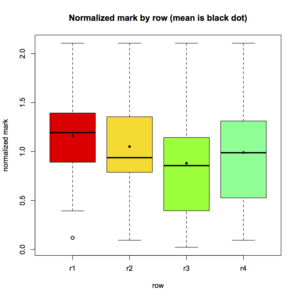
We processed all the data to extract statistically supported conclusions. Firstly, we considered theory groups. We can observe a standard boxplot showing the distribution of data in Figure 1. It shows the Q1, Q2 (median), and Q3 quartiles for each row. The white point in row 1 is an outlier. We performed the Mantel test based on Pearson product-moment correlation coefficient with 999 replicates, and we got a p-value of 0,069. This value indicates that the null hypothesis may be rejected. Therefore, we performed an analysis of variance (ANOVA) using R, and got the following result:
Df | Sum Sq | Mean Sq | F value | Pr(> F) | ||
row | 3 | 6.78 | 2.2611 | 8.348 | 1.89e - 05 |
With this result, and assuming a significance level of 0.05, we can reject the null hypothesis because the significance probability value associated with the F Value, Pr(> F) = 1.89e - 05, is three orders of magnitude bellow the significance level. Hence, the first important conclusion is that the position in a classroom actually influences the marks of the students. Figure 1 shows the plot with the relation row-mark.
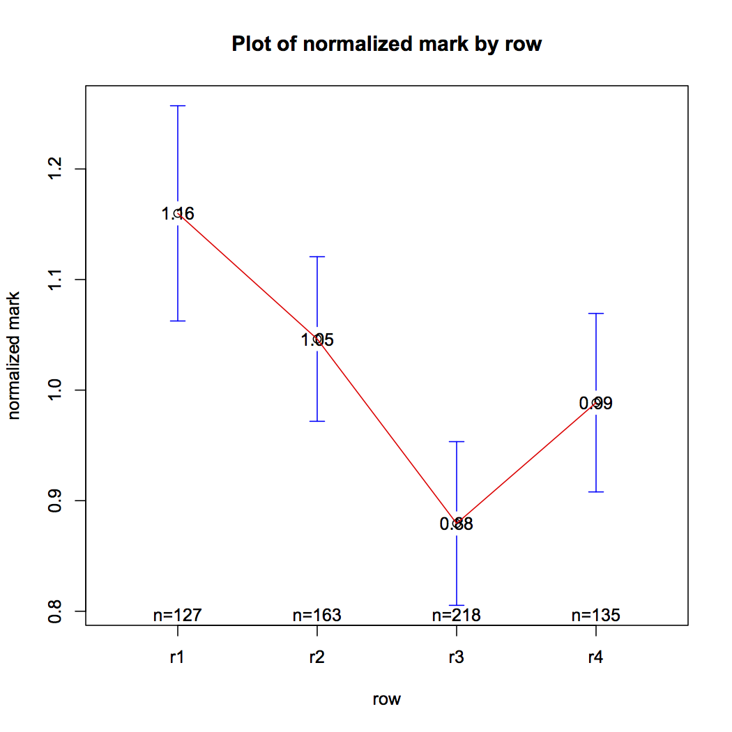
To complement the ANOVA and study the differences between each row, we used the TukeyHSD post-hoc test. It produced the plot in Figure 1, where significant differences are the ones which do not cross the zero value. Hence, this plot provides evidences that rows (r4-r1), (r3-r1), (r3-r2) have different influence on the mark. The influence is the expected one: the closer to the professor (and to the blackboard) the better mark is obtained.
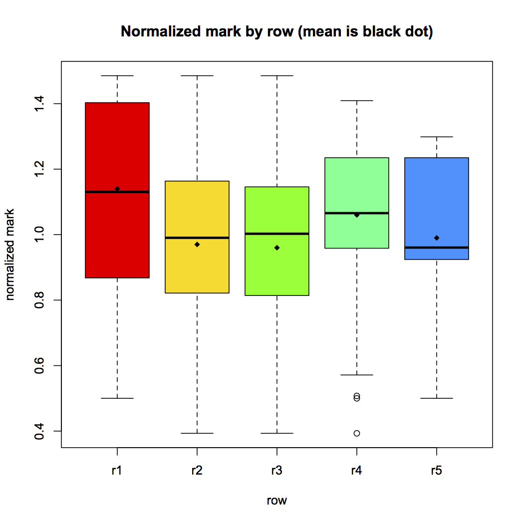
We repeated the analysis for practice groups. The standard boxplot with the distribution of data is shown in Figure 2. We also performed the Mantel test based on Pearson product-moment correlation coefficient with 999 replicates, and we got a p-value of 0,013. Again, this value indicates that the null hypothesis may be rejected. Therefore, we performed an analysis of variance (ANOVA) using R, and got the following result:
Df | Sum Sq | Mean Sq | F value | Pr(> F) | ||
row | 4 | 2.90 | 0.7243 | 12.57 | 6.9e - 10 |
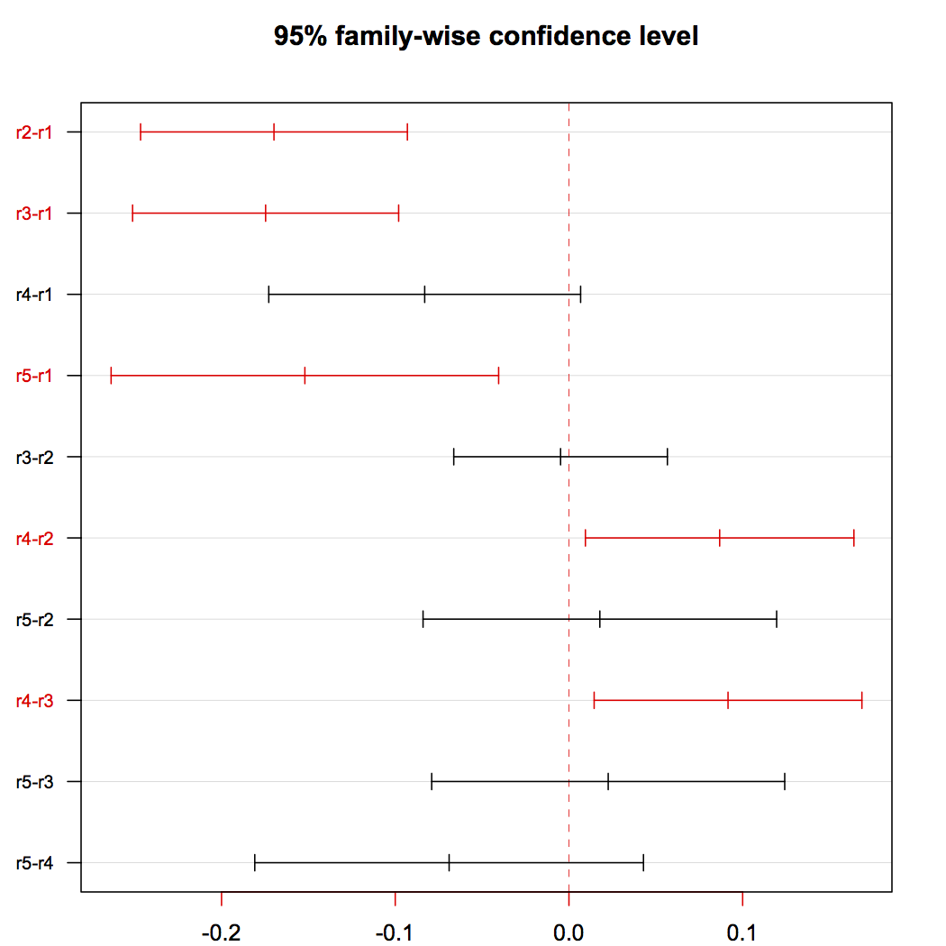
A value of 6.9e - 10 for the probability Pr(> F) clearly indicates that the position in the lab does influence the students’ marks. Figure 2 shows the plot with the row-mark relation. The TukeyHSD post-hoc test produced the plot in Figure 2, which provides evidence that row r1 has a positive influence on marks w.r.t. rows r2, r3, and r5; and row r4 also has a positive influence on marks w.r.t. rows r2 and r3.
After having analyzed the data, our (subjective) interpretation of this phenomenon is that central rows in the lab concentrated the largest number of students, leading them to share computer and to have classmates by their sides, front and back, which certainly influenced negatively their academic achievement.